
Nook shop
A series of workshops followed the design principles strategy to further refine NOOK’s personas and identify both user and business needs around customer journeys.
A FEW OF THE USER PAIN POINTS:
- Brand awareness, lack of product offering
- NOOK has a fragmented ecosystem
- Content is more expensive than competition
- Bad recommendations or search results
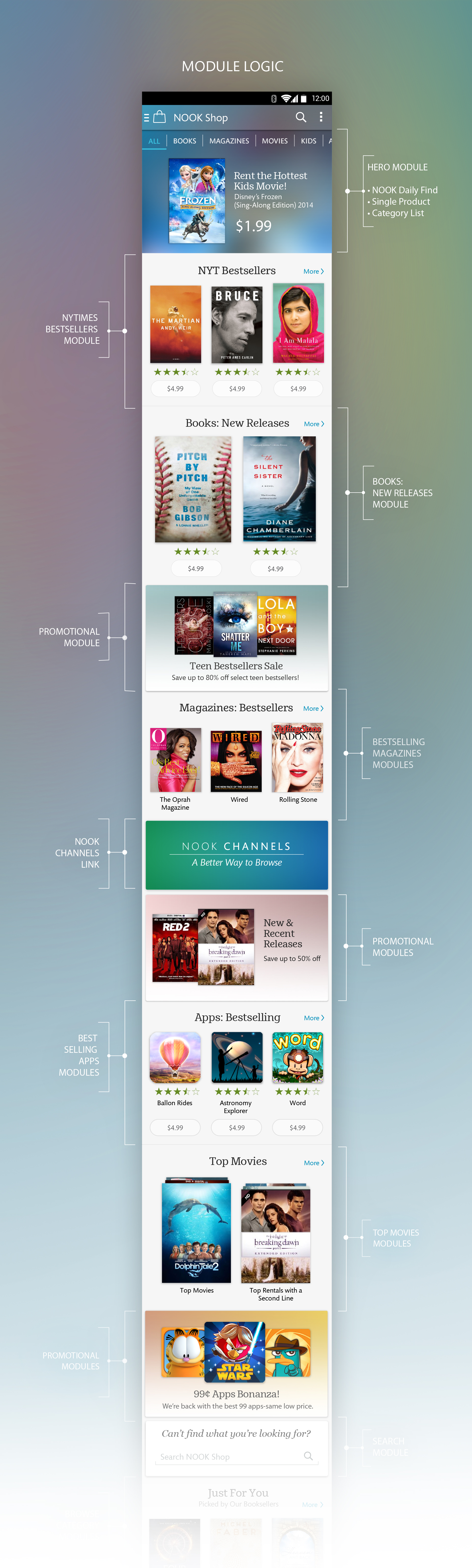
UX STRATEGY / MODULE LOGIC PROPOSED:
- Refresh brand image. Communicate competitive value for both physical & digital.
- Push strategic content to the top while maintaining a balance between not feeling like an advertisement while remaining engaging. Create more engaging content.
- Give users the ability to easily sample/read content before purchasing.
- Search by keywords, topics and samples.


MY ROLE
The visual development of NOOK shop is based on the NOOK design principles.
Boundless Potential:
Use of expansive backgrounds that bleed off the edges, translucent chrome that creates an unobstructed view and gradients that link one category to the next in an ever expanding discovery experience.
Unexpected Delight:
Strategic use of content as background elements to generate engaging content , embellish and raise the bar on the ‘hero spot’.
Clever Companion:
Use of the “hero spot’ to target and surface algorithmic-based content related to a user’s interests.
The deeper a user dives into their NOOK shop experience the more personal it becomes as a user scrolls downward providing an endless discovery loop.
The NOOK Shop experience was designed to scale from the mobile platform to both the Samsung Galaxy 7 & 10in tablets for both portrait & landscape.